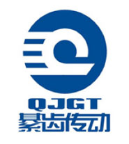
01Architecture
The logo graphic adopts the deformation of the first letter "Q" of the abbreviation QJGT, which is the abbreviation of Qijiang Gear Transmission. It indicates the geographical position of the molars and embodies the characteristics of the gears, and interprets the dynamic properties of the transmission power. . It is combined with the lower "QJGT" and "cartridge drive" to express a distinctive industry brand identity.
02Color
The main body of the logo is blue. Blue symbolizes the sky and the ocean. It means that the company has a long history and unlimited development space. It also symbolizes reason, firmness, diligence and harmony.
03Graphics
The appearance of the logo is round, which means that the company operates in a globalized way, makes friends, cooperates and wins, and develops harmoniously with the society. The inner and outer circles are like high-speed rotating gears, which are combined into a transmission chain, which means that the enterprise is carrying forward the strong culture of the Chinese automobile industry and transmitting strong power for social progress, while inheriting the culture and contacts of the caries.
04Implied meaning
The three teeth with symbolic meaning on the outer circle contain three stages in the development process of the enterprise (entrepreneurship, development, and transcendence), and more imply that the company adheres to the policy of “three innovations” (innovation, excellence, and brand creation), and bravely surpasses yesterday. Challenge today and create tomorrow.